
As you may have noticed, here at MakeAmbigrams we are interested in the art of making ambigrams, generating ambigrams and their history. Part of this has been addressed by some of our posts and tutorials, but we also want to branch out to known ambigram artists to talk about their experiences in the field, their personal lives and the process of making ambigrams.
Our first interview will be with Daniel Dostal, best known in the ambigram world for working on the Flipscript Fyrewater and WyndStorm fonts. His work can be found on his Polish language blog called Signum & Imago and his instagram.
Let’s get started.
1) At what stage in your life did you get interested in calligraphy? Did you get a formal education in the area?
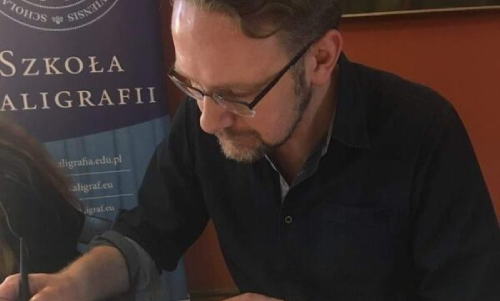
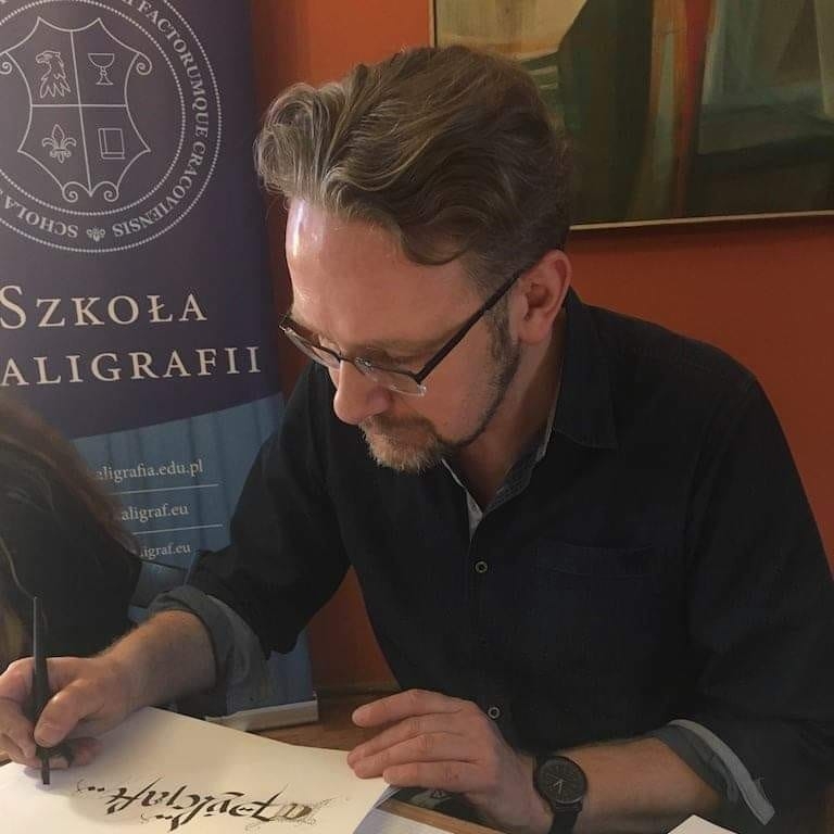
I became interested in calligraphy very late, although all my life revolved around letters. Calligraphy is a kind of culmination of my interests. I studied history, but I specialized in the auxiliary field of this science: epigraphy. It is a science dealing with inscriptions carved in stone. I analyzed nineteenth-century inscriptions from Łódź cemeteries. At that time Łódź was a multicultural city where Polish, German, Jewish and Russian cultures were mixed. This was my first serious contact with the letters. Earlier in high school I designed logos for some bands. I became seriously interested in calligraphy when I ran out of time to realize ambigrams. I must admit that this coincided with the moment when my first son Eric appeared in the world. A picture says more than a thousand words. I didn’t have time but I was hungry for creation. I also knew that a better understanding of the structure of letters would improve the construction of my ambigrams. Fortunately, a branch of the Krakow School of Calligraphy operated in my city and I came under the wings of the outstanding calligrapher Aleksandra Ćwikowska vel Nibme, who led me into the world of written letters. Today I teach classes at this branch but the road to it was long and difficult. There is a Latin sentence “Nulla dies sine linea” which means no day without a drawn line. In fact, in order to master the basics of calligraphy, regularity and consistency are necessary. I dedicate mornings to calligraphy when the whole house is asleep.
An Interruption 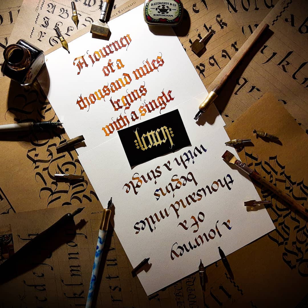
A journey of a thousand miles begins with a single letter
2) You create logos and tattoo designs, did you work in this area before you started making ambigrams? How do you combine this with your ‘main job?’
As I mentioned I designed some logos for bands and zines. It was a hobby job supporting the local music scene and I have never taken it seriously. After graduation, I started working in Castorama, where I am today. I deal with product and POS [sic: point of sale] information. For over 15 years I wrote huge price sheets by hand using ink and felt flat markers. It was a good school of lettering. Unfortunately, today this sphere has been supplanted by printing. Another sphere in which the machine displaced man.
3) You have a background in history, did that help with your calligraphy passion or was that completely separate?
I am a historian and I see the development of Latin script from the perspective of history. The changes in Latin script are closely related to historical events. The fall of the Roman Empire, the Migration period or Reformation had a huge impact on the development of our writing. Development of our script was greatly influenced by various historical figures. It was pushed forward by eminent rulers such as Emperor Constantine the Great, Charlemagne or Emperor Maximilian I, scholars such as Eusebius of Caesarea, Columcille, Alkuin of York, artists like Albrecht Dürer or outstanding scribes like Poggio Bracciolini, Ludovico Vicetino degli Arrighi or Johann Neudorffer. The stories associated with these people are amazing. During my calligraphy workshops we learn not only letters but their genesis and historical context. I always use source texts and poems or literary works from this period. This and the story about the authors brings students closer to the time and place of birth of the script.

4) In your blog you say that you discovered ambigrams in Dan Brown’s ‘Angels and Demons’. Do you still recall your first ambigram and the process that you went through making it?
Yes I remember this time, when I found in one of the magazine’s review of Dan Brown’s books. I immediately purchased “Angels and Demons”. Opening the book, I came across amazing ambigrams. I felt magic and asked myself how it is possible to create this amazingness. I decided to understand the process of creating ambigrams by creating them myself. I checked the date of issue of my book. It was 2003. The first ambigrams which I created were simple and based on the modifications of the Cloister Black font. One my first of my ambigrams was an ambigram of my name. For five years I created ambigrams only for myself, and finally in 2008 I showed them to the world on my blog Signum et Imago. However, the real breakthrough was participation in the NAC (sic: Nagfa’s Ambigram Challenge). This is a challenge organized by one of the most creative ambigram creators at that time – Nagfa from Singapore. Subsequent editions of this challenge were a real holiday for our little community and an opportunity to meet great ambigram creators. We were far away, but we formed one family.
5) Did this process evolve over the years? Can you tell us about your process for making ambigrams now? Also what materials do you use?
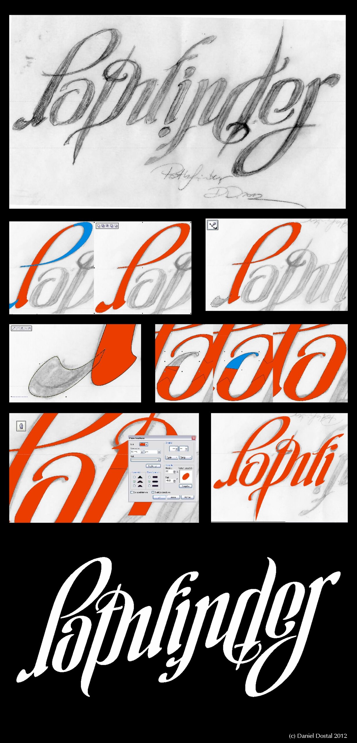
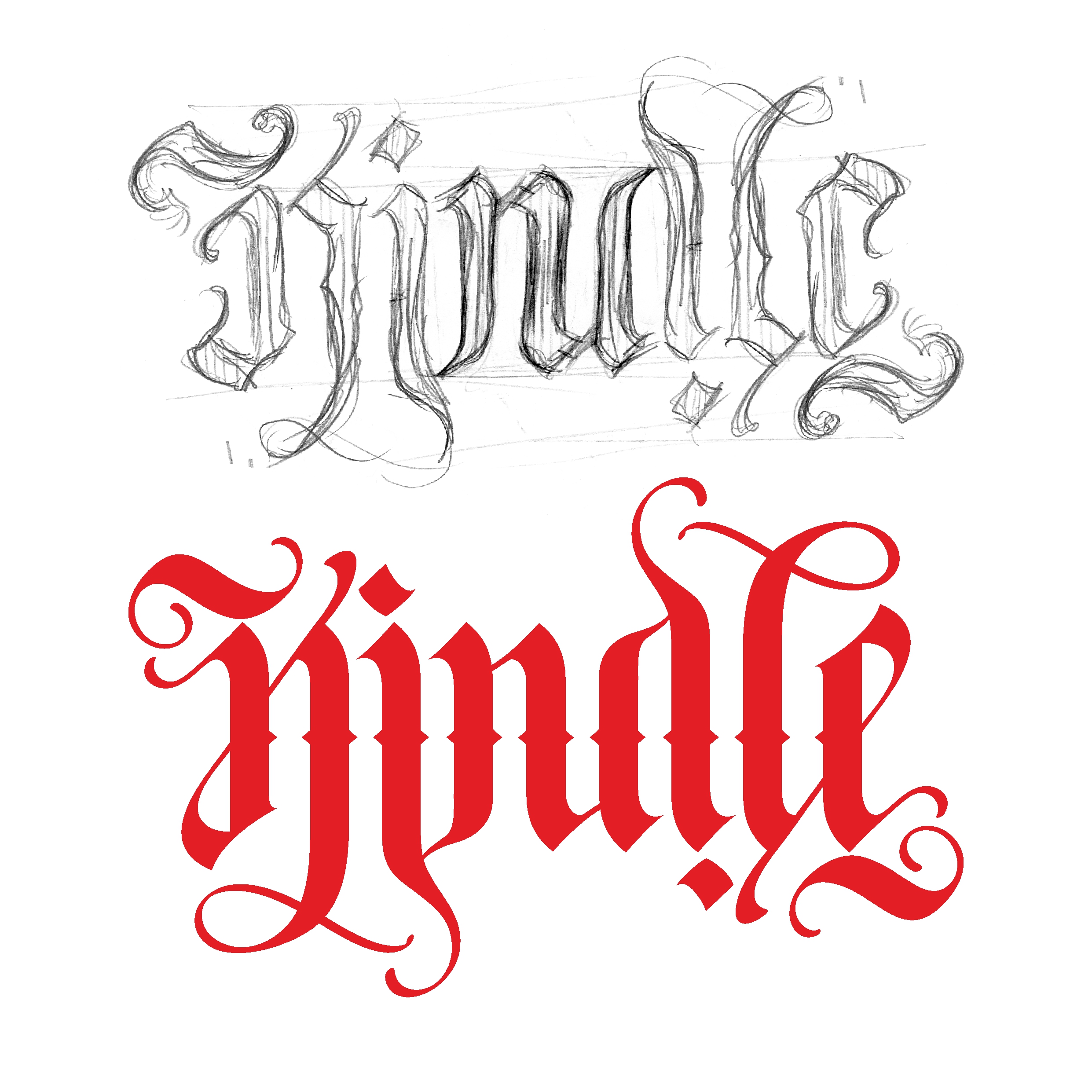
Yes my process evolved over these long years. As I mentioned, my first ambigrams were based on modifications of the existing fonts. I quickly gave up this method. These ambigrams were crude and not very original. The optimal process is to quickly sketch the ambigram and process it on my computer. Today I use calligraphic tools for sketching more and more often.
6) What software do you use for making/digitizing your ambigrams? Can you tell us about the process?
I’ve used Corel Draw all these years. This is a very intuitive program which I have mastered thanks to my main work. The functions associated with editing curves and nodes are excellent. Switching to another program would involve a change in habits and thus a decrease in productivity.
I always start with a sketch. Sometimes it is a cursory sketching of the main elements, but more often, I devote more attention to the sketch, which saves a lot of work in the graphics program. Then in Corel I create all the letter components using Bezier curves. Initially, the elements contain a lot of nodes. The next step is to reduce unnecessary nodes and give the lines the desired shape. The last stage is adding ornaments, which I love doing. Although I realize that sometimes they can make an ambigram less readable. Most often I present ambigrams on a black background – the characteristic color of the letters is the scanned texture of the pulp of an apple.
7) Rotational ambigrams are generally the most popular, probably due to Dan Brown. You also seem to focus on these rather than all the other types of ambigrams. Why do you think that these are so popular and why do you mainly focus on them?
In my opinion rotational ambigrams are easier to create and more readable. That’s why I’m more willing to do them. In mirror ambigrams, letters more often “refuse to cooperate”. But there are in the world of ambigrams a lot of artists who raised the art of creating mirror ambigrams. Nevertheless, my debut in the world of ambigrams was a mirror ambigram created for Nagfa’s Ambigram Challenge in 2008.
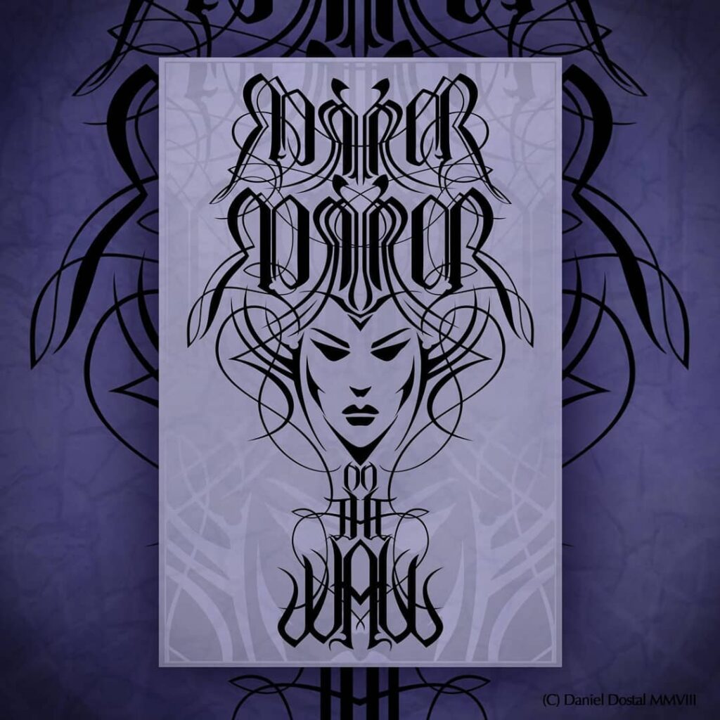
Mirror ambigram; ‘Mirror mirror on the wall’ 
Ambigram: “Love never dies” 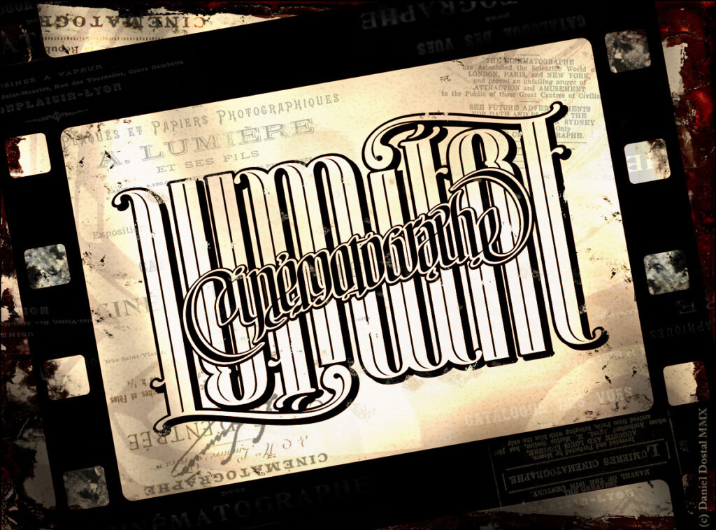
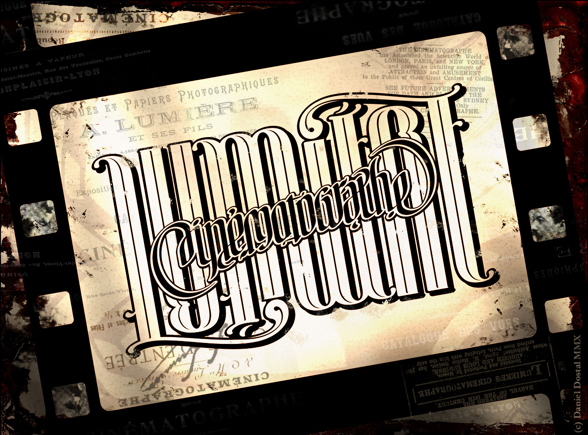
Ambigram: “Cinematographe Lumiere “
8) Most of your ambigrams seem to be made in a Gothic font. Why do you think that this font works so well for ambigrams?
The Gothic script known as Blackletter is characterized by a dense structure where the interior spacing and internal light of the closed letter is the same width as the vertical lines. Roundings and curves are limited to the minimum. Because of that the construction of all letters is similar. This makes all ambigram modifications easier. Gothic writing is less readable and the consequence of using this typeface for ambigrams is less readability too.
Gothic script illegibility was realized even where it was used for the longest time, in Germany. In 1941, it was decided to replace Gothic with a Roman script.
Sometimes readability is not the most important thing, but the ephemeral mysterious mood that has so enchanted me in Angels and Demons. When readability and elegance are key, I choose a different typeface that I created during my work on the Cinematographe Lumiere ambigram.
9) Your blog is in Polish but most of your ambigrams are in English. Could you tell us why you do not make more Polish ambigrams? Is English better suited for ambigrams or is it a matter of accessibility/preference? In general it is rare to see non-English ambigrams,so it would be interesting to hear your opinion on this.
The choice of language is a matter of receiving my ambigrams in the world. I direct them to a universal recipient. Hence the choice of English and Latin – two languages that are today and yesterday a kind of “lingua franca”. In fact, English and Latin words are consistent and shorter than Polish.
10) You are listed as the main designer for the two flipscript fonts. Could you tell us about your experiences with that?
I don’t remember the backstage of the first script known as Wyndestorm. It was at the beginning of 2010. Mark Hunter asked me for cooperation, we developed the script’s assumptions and for some time I was reading the list of glyphs to develop. Some of them are simple “letter for letter” and some contain more complicated modifications. I developed several hundred glyphs, in parallel Mark with others worked on other, simpler modifications. I don’t know the details of the generator mechanics, maybe Mark will reveal some details someday. A year later, we started working on a script called Blacknote (today known as Fyrewater). This time Mark sent some samples of gothic fonts asking to create trial ambigrams that were to be the starting point for the whole system. At this stage, my suggestions were consulted with John Langdon. We worked on other glyphs based on mutual suggestions and file sharing. Despite the work in various systems and software thanks to saving files in svg format there were no problems and program conflicts.
11) Do you think that the flipscript generator is the peak of ambigram technology or do you envision something better coming up eventually?
Flipscript is a great amazing tool but remembering my correspondence with Mark it seems to me that more individualisation and detailing is possible. However, this requires many additional glyphs and hours of work.
12) As someone who helped develop an ambigram generator, what is your opinion on them? Some ambigram artists frown on people using them for inspiration.
I think that as a tool supporting the creative process it is very useful. It can be used as a guide. However, I don’t like using the unique glyphs and signing the generated ambigrams as an original work.
13: Can you tell me about your experience working with John Langdon?
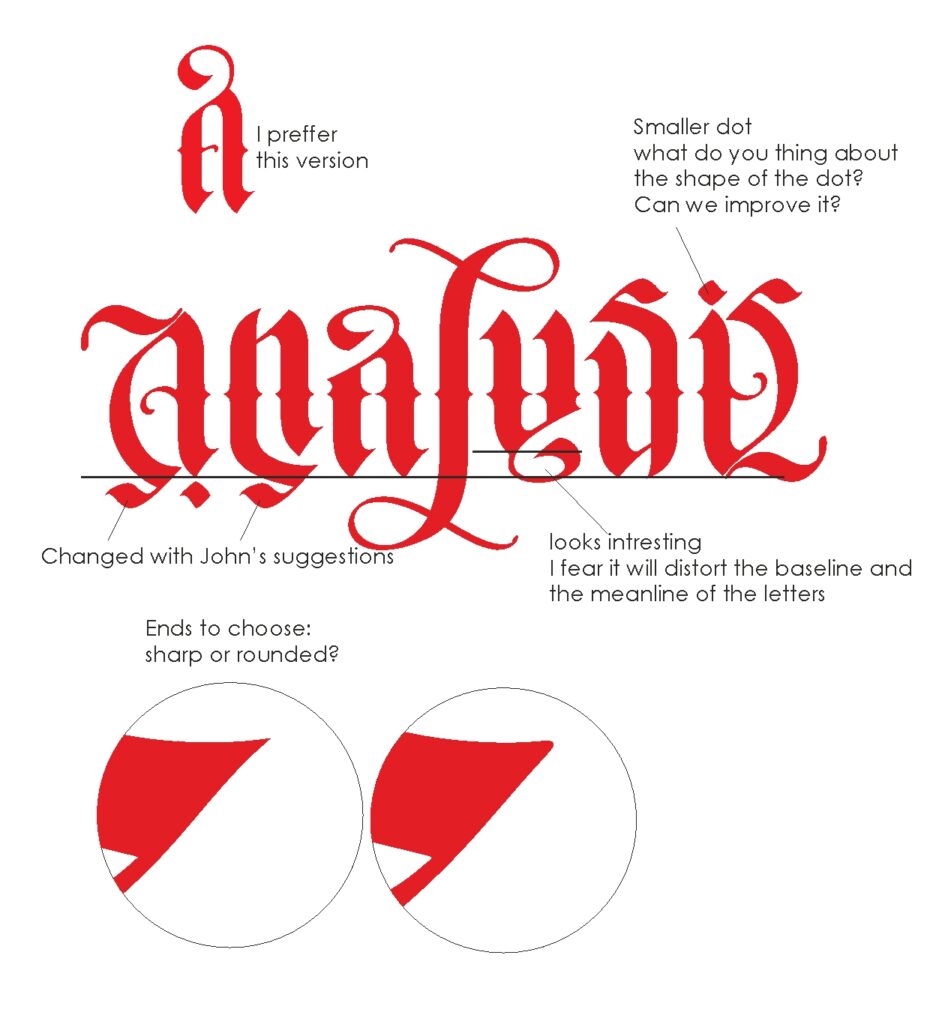
My cooperation with John is one of my greatest experiences and achievements. The cooperation was based on dialogue and mutual suggestions. Observing his corrections and suggestions I learned a lot. Each change was accompanied by his commentary. Thanks to such cooperation, we managed to select the most wonderful glyphs. John sometimes limited my tendency to flowery – but this resulted in the consistency and readability of the script. I also gained a lot in the workshop by looking at his methods of working with vectors. It was a really great time.
14) Do you have any current or future projects in the works?
I am currently focused on calligraphic works. My goal is to create the widest possible range of templates for various historical calligraphic styles. Ambigrams are still in my heart but I still don’t have enough time for them.
My fascination with Albrecht Durer’s Textura resulted in some ambigrams based on this typeface. Most likely, several such ambigrams will appear in the future.
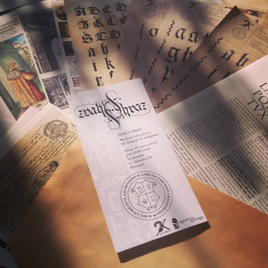
I plan regular workshops mixing calligraphy and ambigrams. Last year in Warsaw this kind of workshop took place. We learned the basics of gothic calligraphy based on Textura and Fraktura and next used this knowledge to create calligraphic ambigrams. [Current workshops are put on hold due to the Covid-19 pandemic.]
15) Do you have any advice for aspiring artists just starting with ambigrams?
Because ambigrams are a kind of typography for everyone who starts, I would advise them to start by learning the structure of letters, letter and inter-word spaces. Take up lettering, computer typography or calligraphy and build your ambigrams on this basis. You will immediately know which solutions and modifications are good and which disqualify the work. Many letter modifications are obvious but also look for your own solutions by combining 2, 3 or even 4 letters in one glyph. Watch others but always try to work your own way. Take frequent breaks while working on the ambigram. A fresh look the next day will make you find the right solution and modification. You’ll also see an error you didn’t see the previous day.
Thank you very much Daniel!
All images are owned by Daniel and used with permission.
For current updates on Daniel’s work, follow him on Instagram and his website.